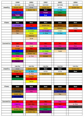
Color Trends: 1990 - 1998
AN OVERVIEW OF COLOR
Observations of color in the 1990s led to the discovery of many patterns relating to the context of the time. One of the major factors that appears to have influenced color is the recession that occurred in 1990 and 1991. For apparel and accessories, color started out bright but then as the recession continued more muted colors took their place. Bright colors phased in and out throughout the rest of the 1990s, switching between concentration on apparel and accessories. Home interiors saw a more consistent pattern of colors, starting out rather muted during the early 1990s but then transitioning into brighter colors as the decade progressed. During the 1990s, it seemed that there was more color correlation between apparel and accessories than between apparel or accessories and home interiors.
Color in Apparel
by Danielle Hickman
Overall, apparel color trends in the 1990s appeared to directly mimic the economic trends of the time period. For example, the years 1990 – 1992 lacked overall color (with the exception of spring/summer 1990) seen in 1996 – 1998, something that could be a result of the recession. Executive director of the Pantone Color Institute explains that “the state of the economy might have the largest impact on the colors consumers favor. When the market tanks, people often retreat to neutrals. But lately, instead of ignoring color -- think back to the grunge trend during the downturn of the early 1990s -- people tend to be cautious with big-ticket items but add color through less expensive purchases.” This seemed to be a growing trend throughout the ‘90s, as I saw many spreads urging consumers to add color without breaking the bank, or buy versatile clothing in basic colors.
Color in Accessories
by Lindsey Crane
While researching the color of accessories, it seems that the trends coincided directly with the social mood. When consumer confidence was low, due to just coming out of a recession, there were minimal accessories being worn and any accessories that were being worn, there was a lack of color. When shoes were bright in color, cosmetics and jewelry were neutral, and when cosmetics and jewelry were bright, shoes were kept simple. Main questions that arose while doing the research was if the minimal accessories had to do with bright color use in apparel and vice versa. What caused color to back a comeback in 1998?
Color in Home Interiors
by Danelle Howell
After researching and collecting colors that were popular for home interiors in the 1990s, it is apparent that colors correlated rather closely to the social mood of America. Early in the 1990s, most of the colors were pastel or muted, with the exception of a few bright colors during the spring and summer seasons, which matches the somber mood that people were in during the recession of 1990 to 1991. As the US started to recover from the recession, colors started to become brighter and bolder, especially during the summer months. This is particularly demonstrated in 1992 when people who were only just beginning to recover from hard economic times felt that their home was one of the only places where they had control. Although common for the brighter, bolder colors to be associated with the spring/summer season, these colors also started appearing in the fall/winter season as the 1990s progressed into a more positive social mood. Although nearly every season was graced with one or more important neutral colors, these colors were often used to help the bolder colors pop.
Sources: ‘90s Fashion Trends, 1990’s Fashion Trends, 1990s Fashion Statements for Men, Colour research and trend forecasts from Pantone Color Institute , Harper’s Bazaar, House Beautiful, The 1990s Fashion History Part 2, Vogue.


0 comments:
Post a Comment